GROVE
MY CONTRIBUTION
Primarily responsible for developing sketches, wireframes, UI design (Iteration #2), and prototype. Helped with quantitative and qualitative research (interviews, digital survey, journey mapping, user feedback sessions).
TOOLS
Sketching, Figma, Illustrator, Mural
PROJECT OVERVIEW
The Problem
Our Solution
Process Overview
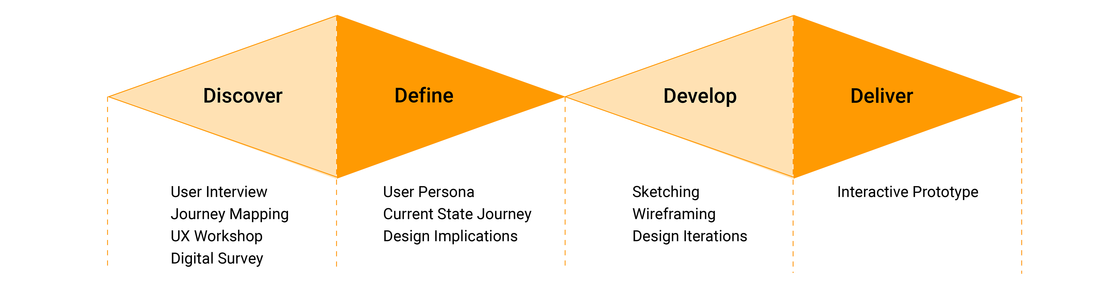
DISCOVER
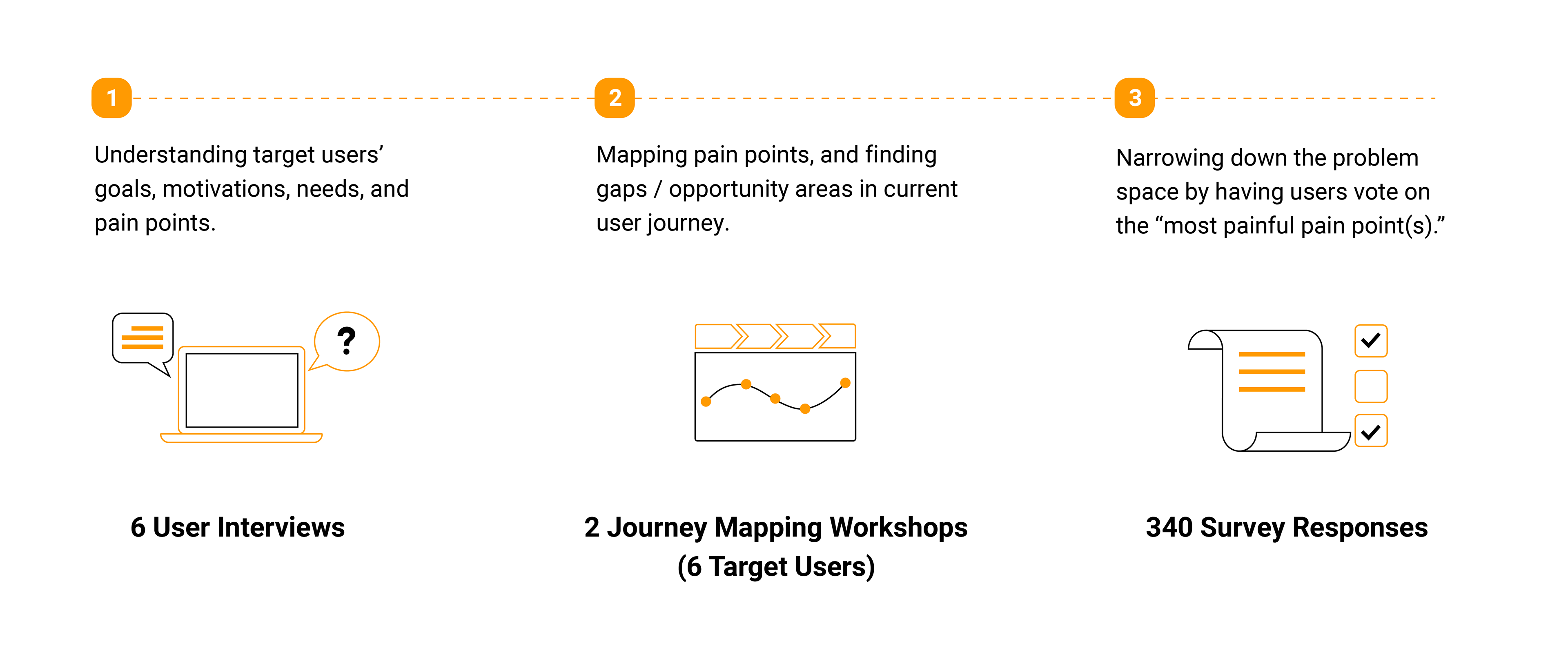
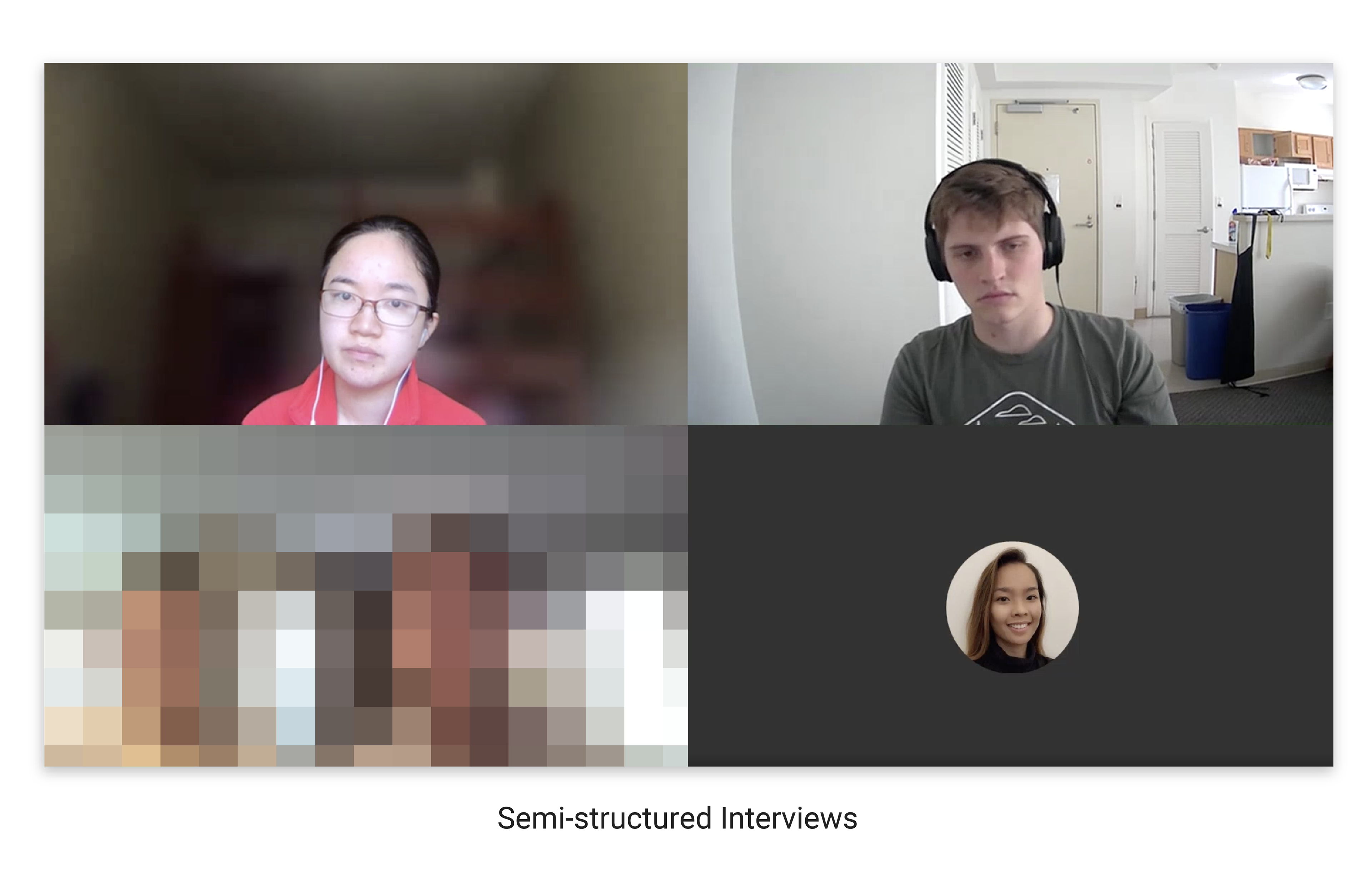
01. Semi-Structured Interviews
As a first step, we conducted 6 semi-structured interviews to learn about vegans and vegetarians' motivations, goals, needs, and pain points when dining out. This helped us empathize with our target users and sketch out a rough user journey.
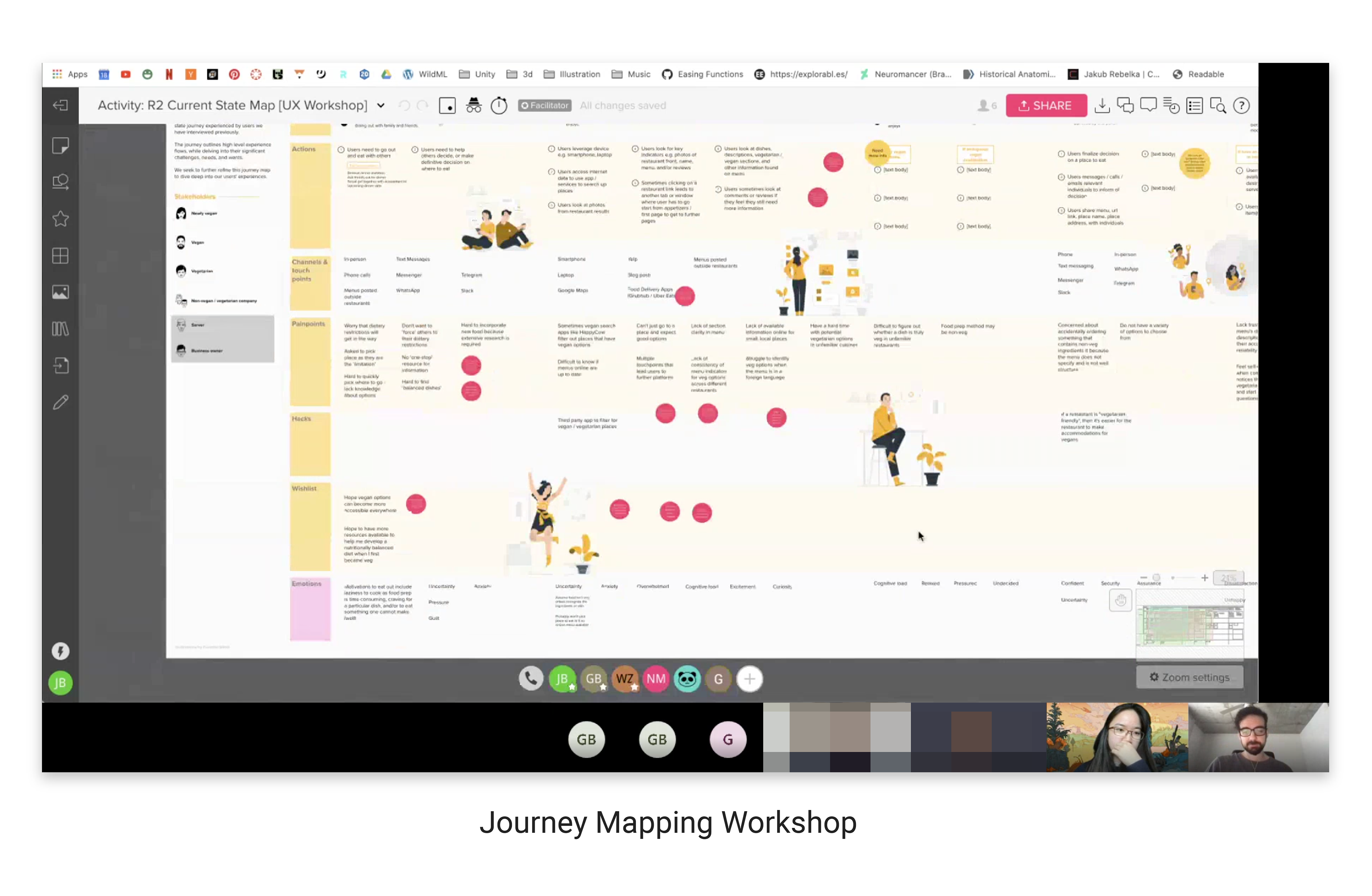
02. Mapping Out User Journey
We held two workshops to refine our initial journey map with 6 target users. These workshops helped us better understand the user's current journey, reinforced the pain points at each phase, and gave us a better idea of the opportunity areas and gaps in the current process that might benefit from intervention. However, the problem was that we had a giant map that covered lots of issues across the entire user journey.
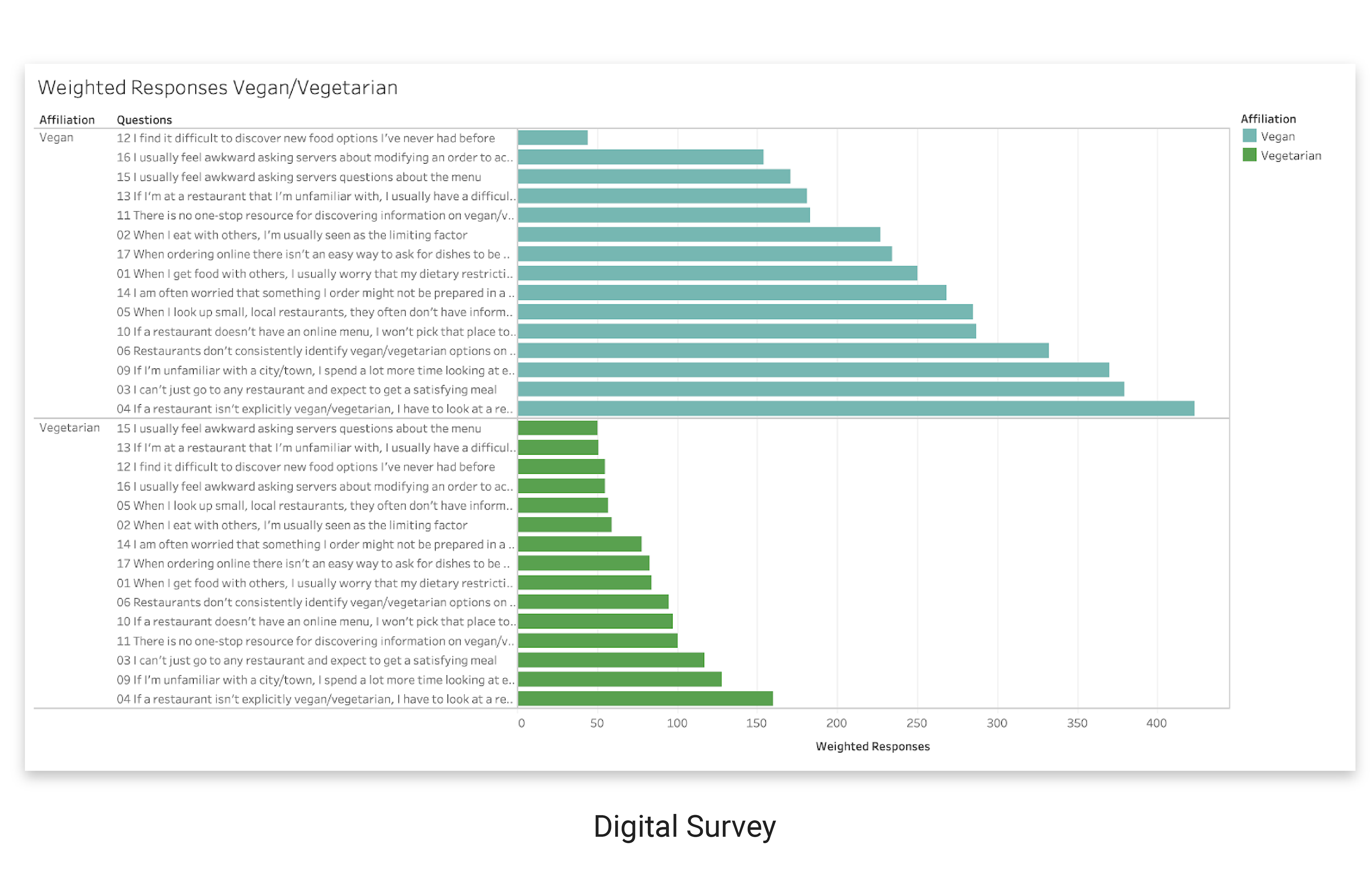
03. Digital Survey
We used a digital survey as voting mechanism for our target users to reflect on the severity of each pain point. We released the survey on various channels (vegan and vegetarian subReddits, Georgia Tech Grad Students Facebook, etc.)
The survey participants ranged from people who have recently transitioned into a vegan / vegetarian diet, to those who have been vegan or vegetarian for more than 5 years. Yet they still encounter very similar issues. The top 3 pain points for both vegans and vegetarians were the same, and fell under "Explore & Compare Options" ("Discovery" phase).
DEFINE
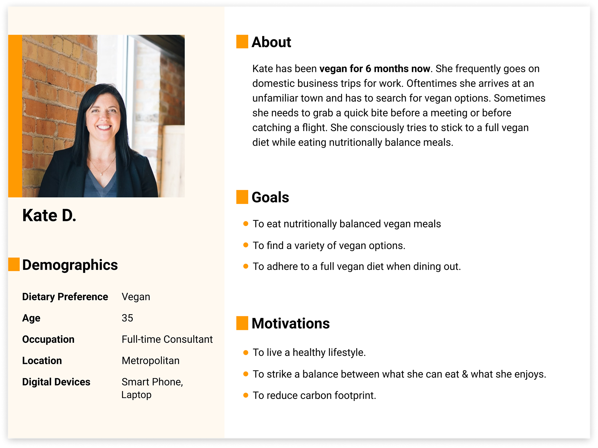
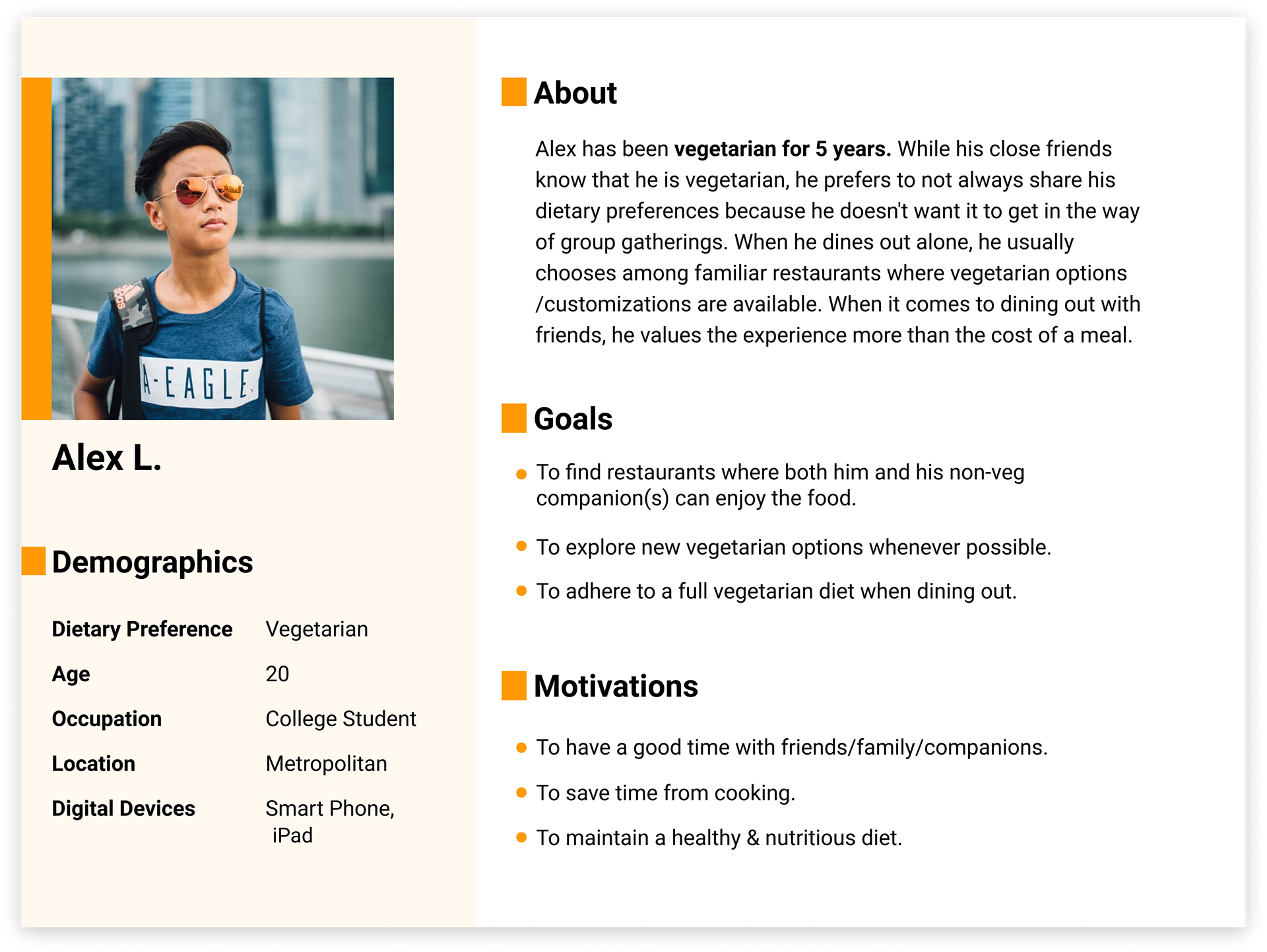
Based on the survey results, we decided to focus on the "Explore & Compare Options" phase of dining out. This includes looking up a restaurant, exploring and comparing different options. We developed user personas and current state journey map to help us better understand, define and visualize user needs.
User Persona & Current-State Journey Map

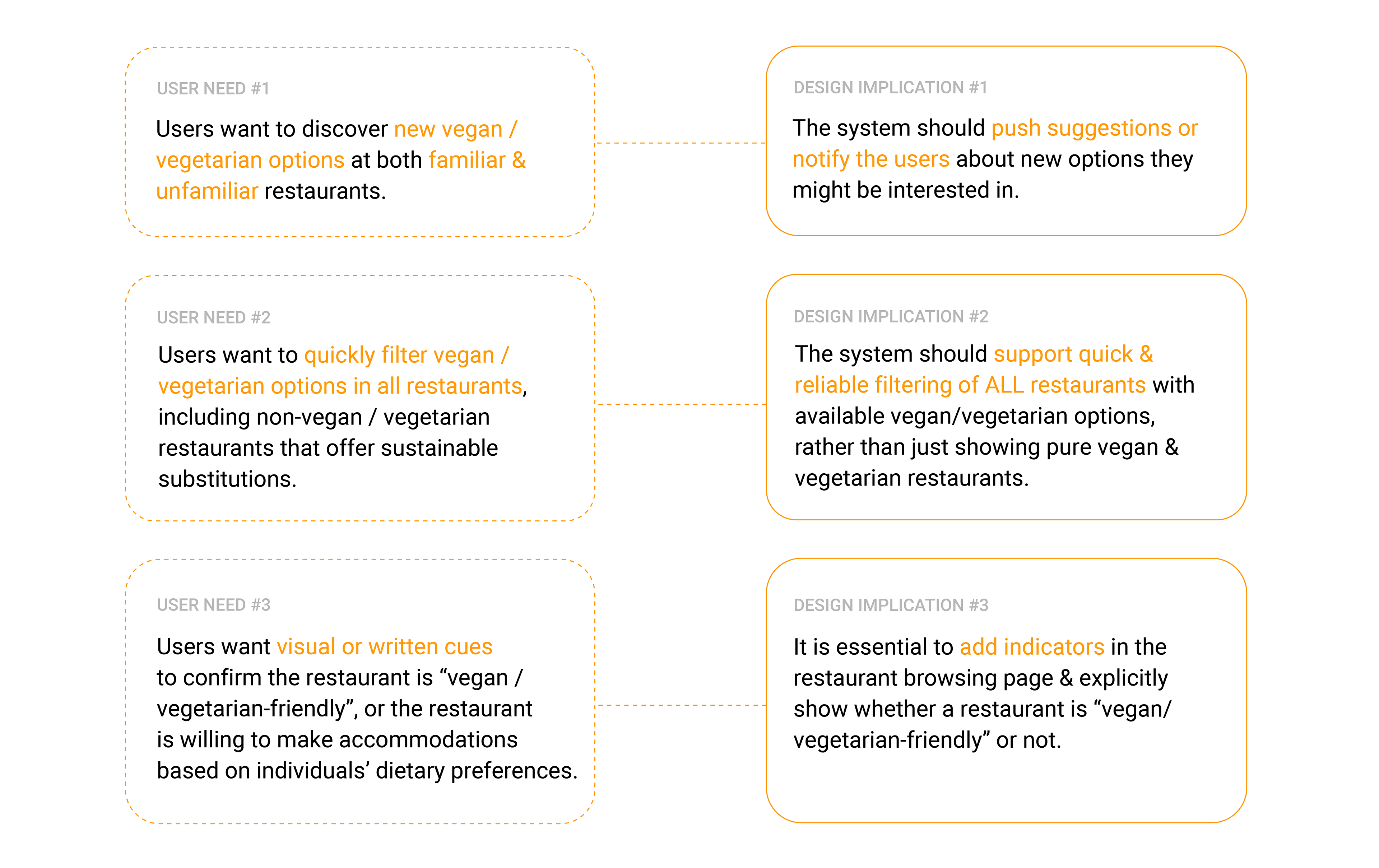
User Needs & Design Implications
Based on user personas and pain points of "Explore & Compare Options", we identified key user needs and translated them into concrete design requirements as follows:
DEVELOP
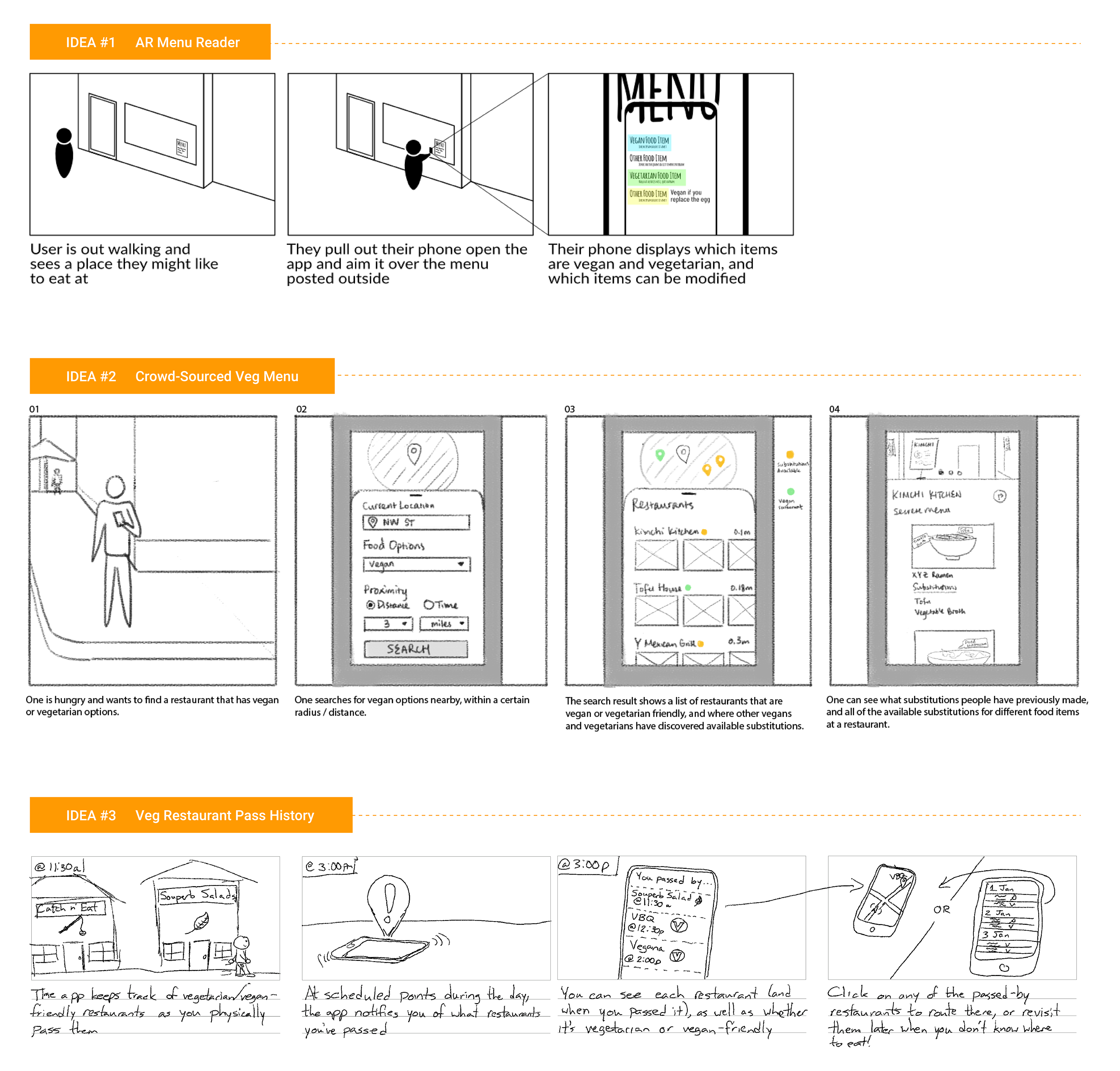
Storyboards
With user needs and design requirements in mind, we held a group ideation session remotely on Mural. After generating and expanding on our ideas, we selected three ideas and developed storyboards to get some initial user feedback.
Idea #1 (& its use case) didn't resonate with our users' mental model and current practice. Users found Idea #2 to be helpful, and Idea #3 to be novel and worth-exploring. Based on user affinity and internal discussions, we decided to pursue Idea #2 and #3 further.
Wireframes & User Feedback
After fleshing out the user flow of the two selected design ideas, we conducted four (4) user feedback sessions. The primary goal was to get feedback on user (task) flow, Information hierarchy, and clarity in section layout.
We presented our wireframes and ran the study on Mural. Adopting the Wizard of Oz method, we hid all subsequent wireframes and only revealed one screen (wireframe) per time. As users verbally describe their steps and trigger new actions, the corresponding screen was then revealed.
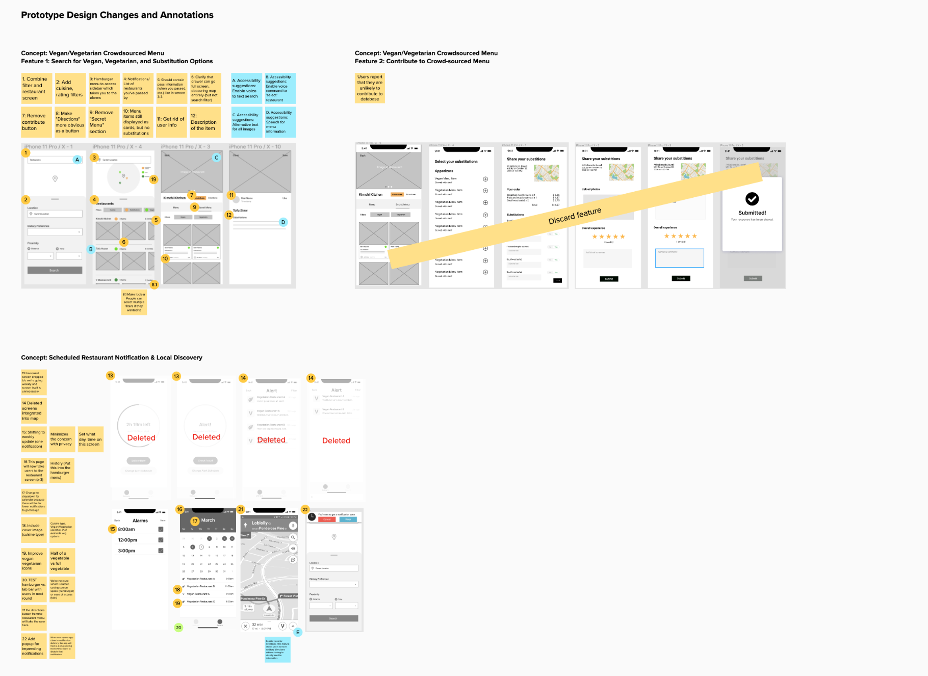
Prototype (Iteration 1)
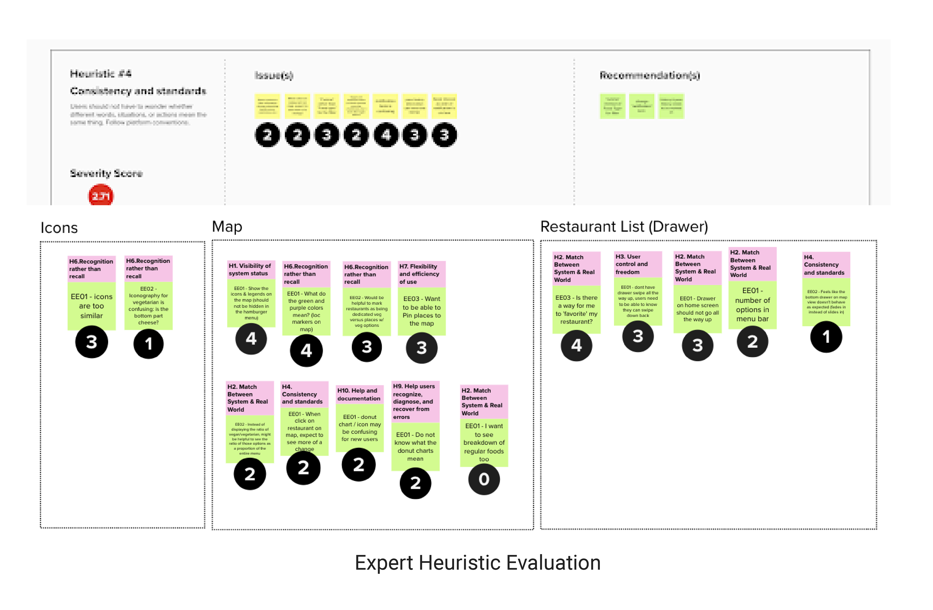
Prototype Evaluation
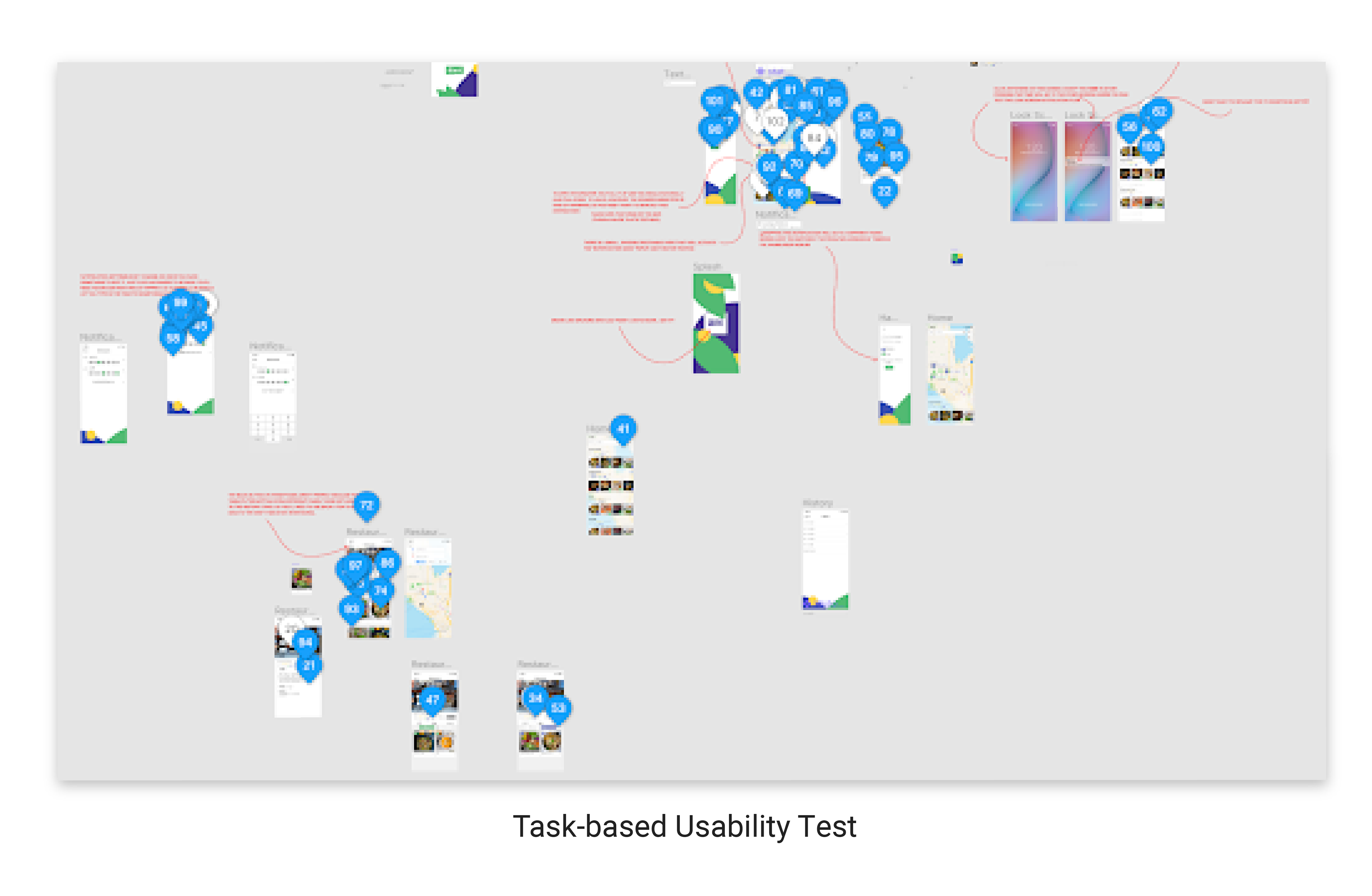
We conducted 3 Heuristic Evaluations and 3 Task-based Usability Studies, which helped us discover and prioritize usability issues to fix in the next design iteration.
Prototype (Iteration #2)
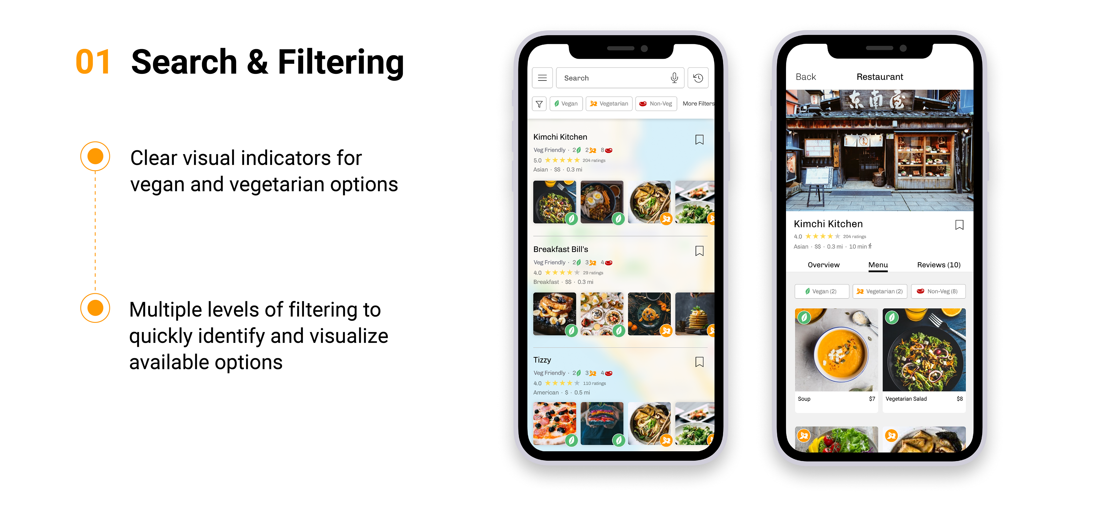
Key Feature 1: Search, Filter & Compare Restaurants
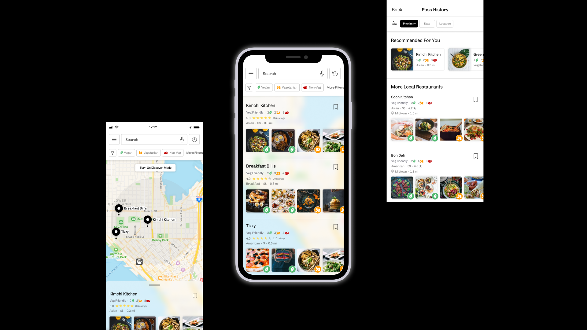
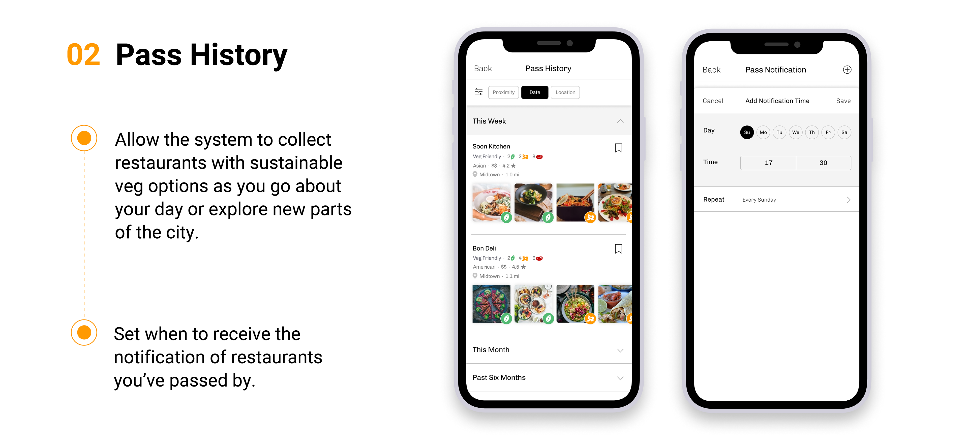
Key Feature 2: Pass History
DELIVER
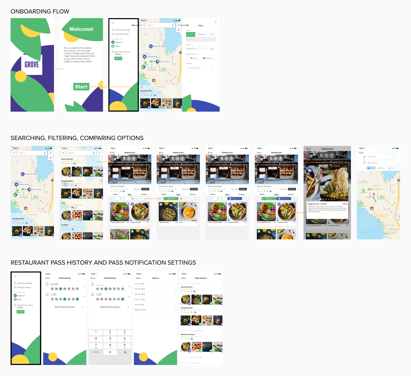
High Fidelity Mockups
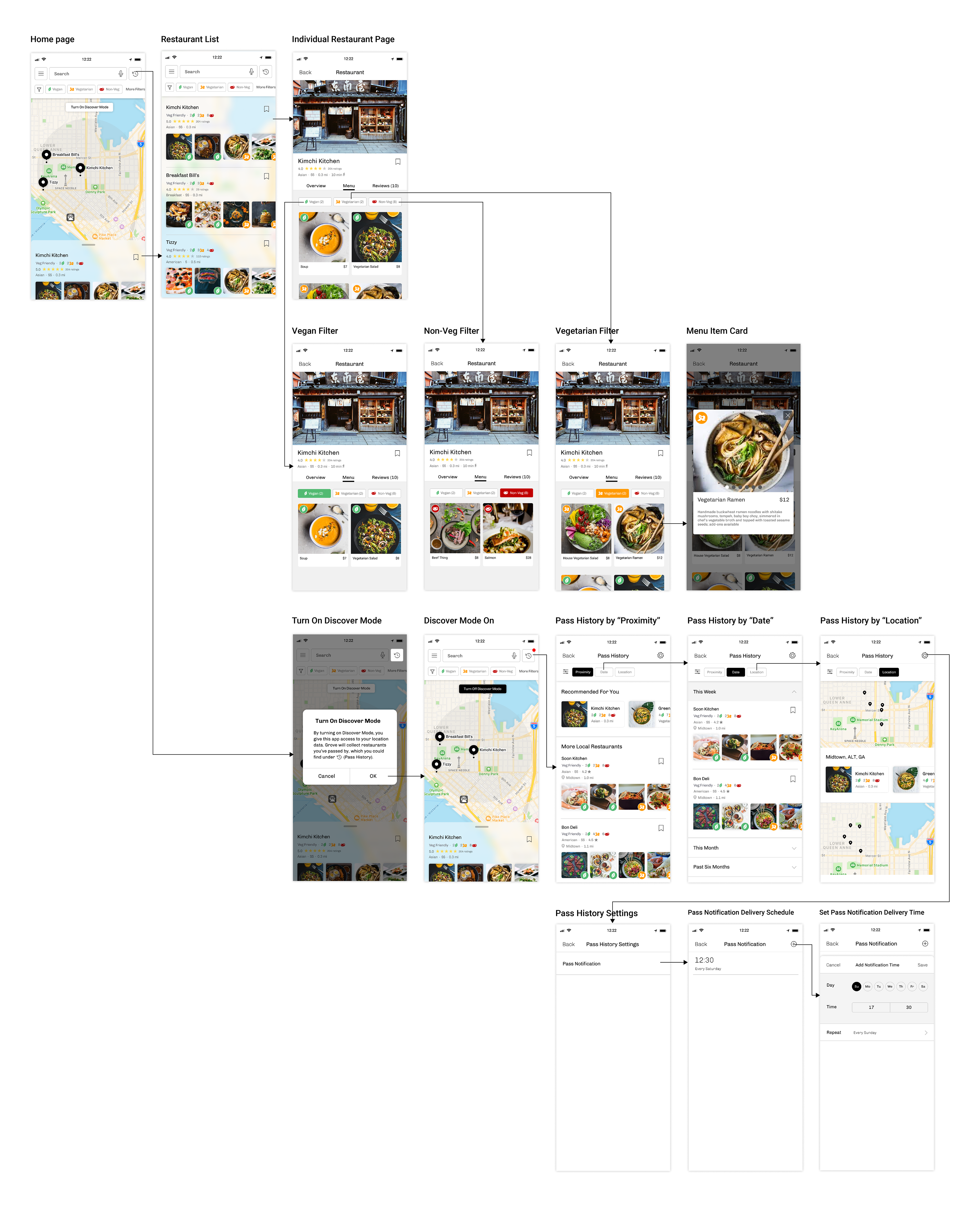
Key Features / User Flow
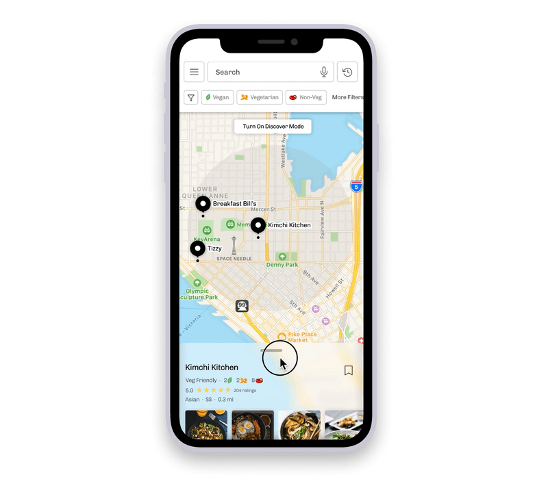
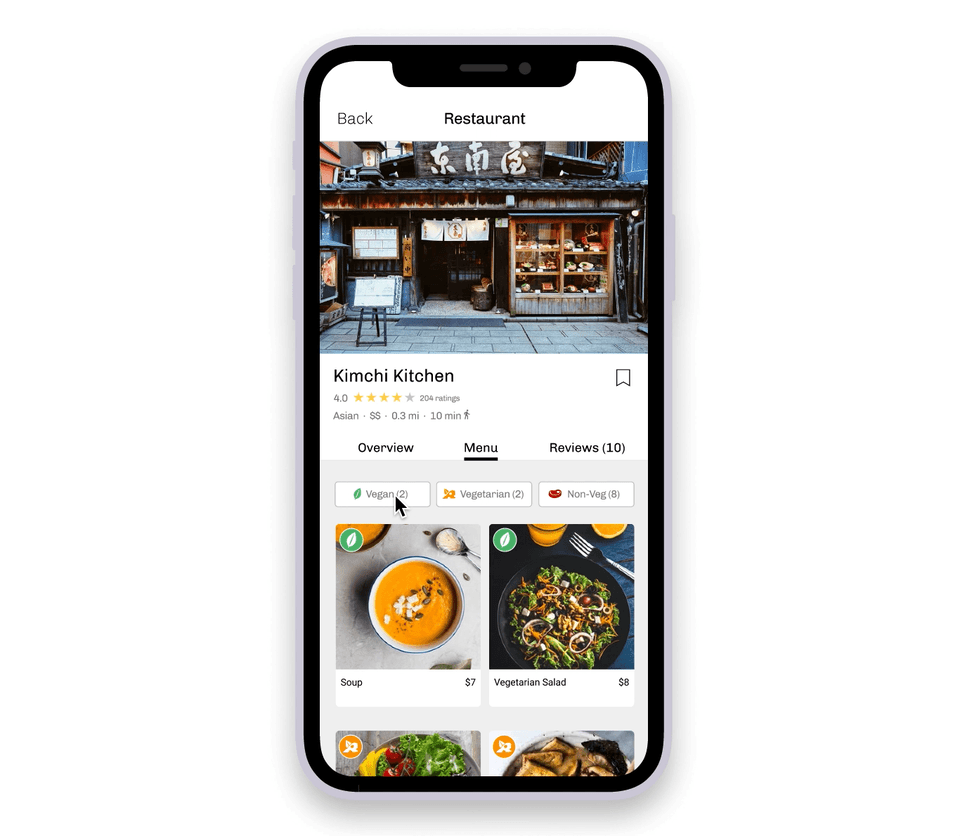
Browsing & Comparing Options
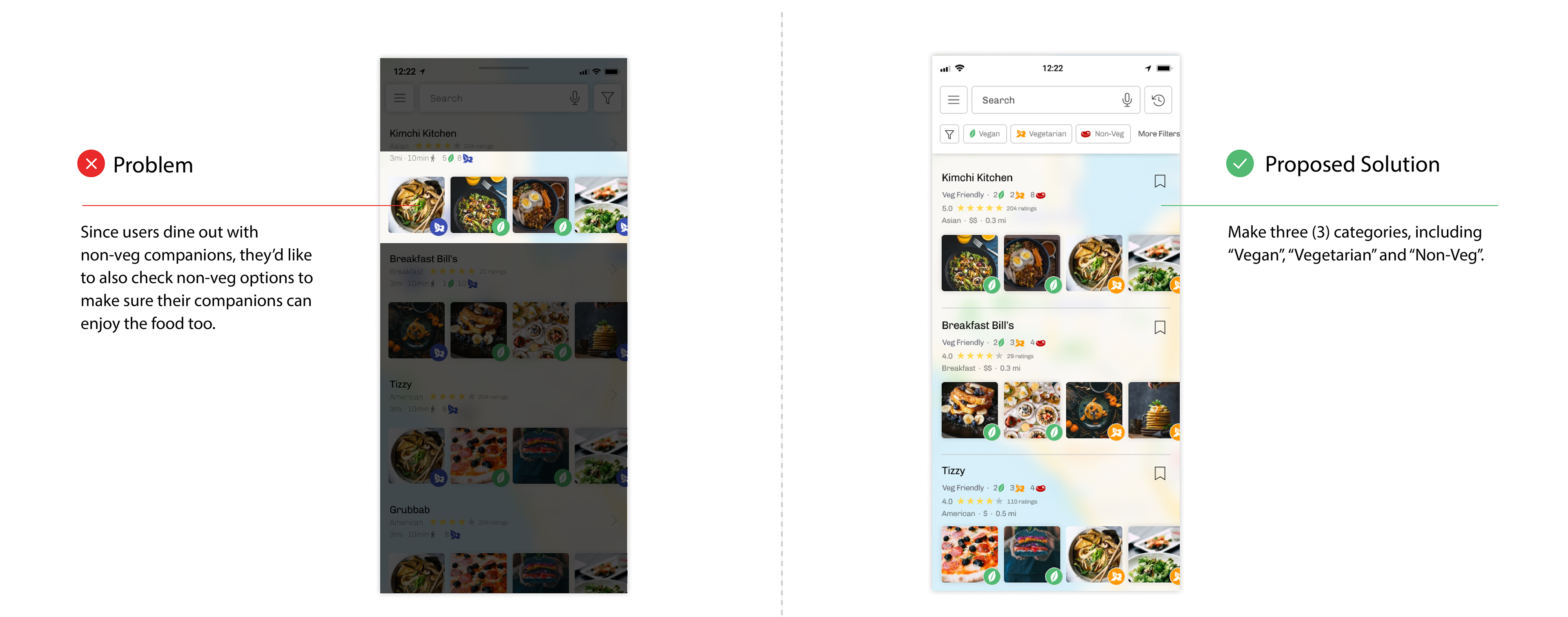
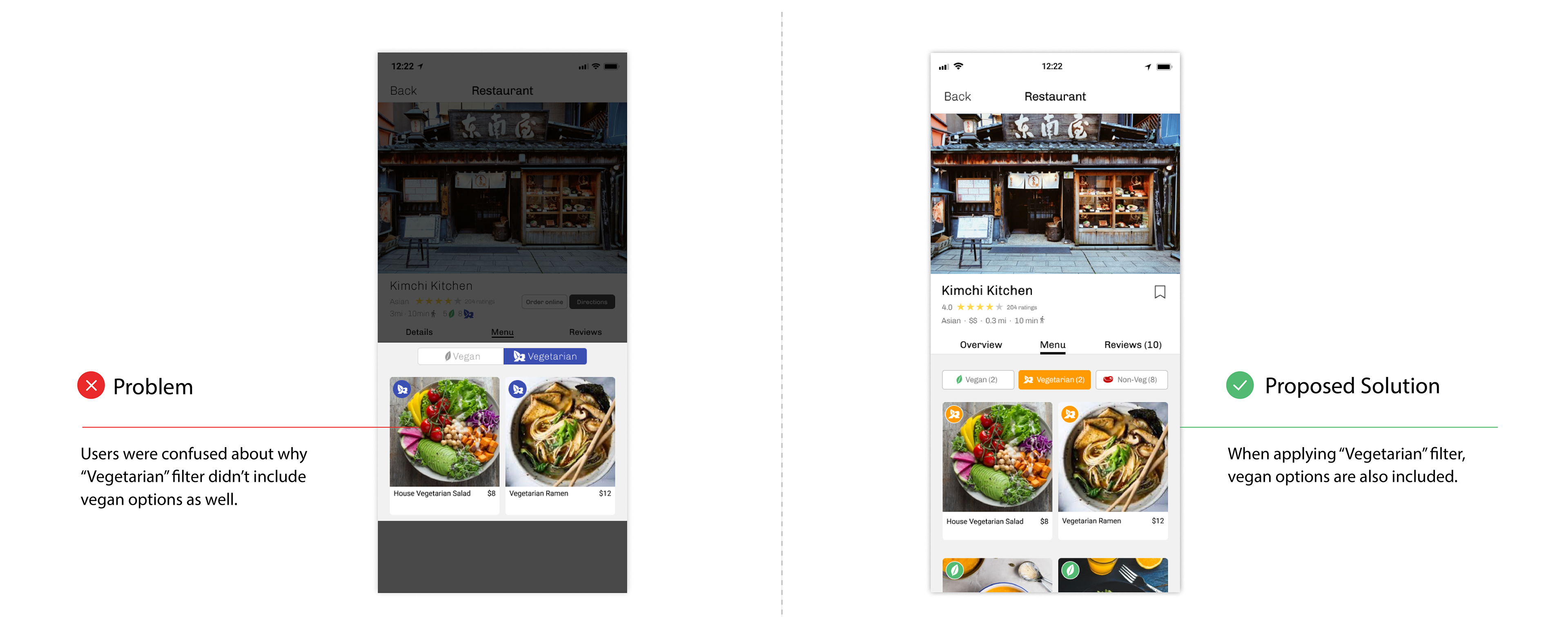
• Clear visual indicators to help users visualize available vegan, vegetarian, and non-veg options.
• Individual menu item cards for users to learn about specific ingredients in a dish.
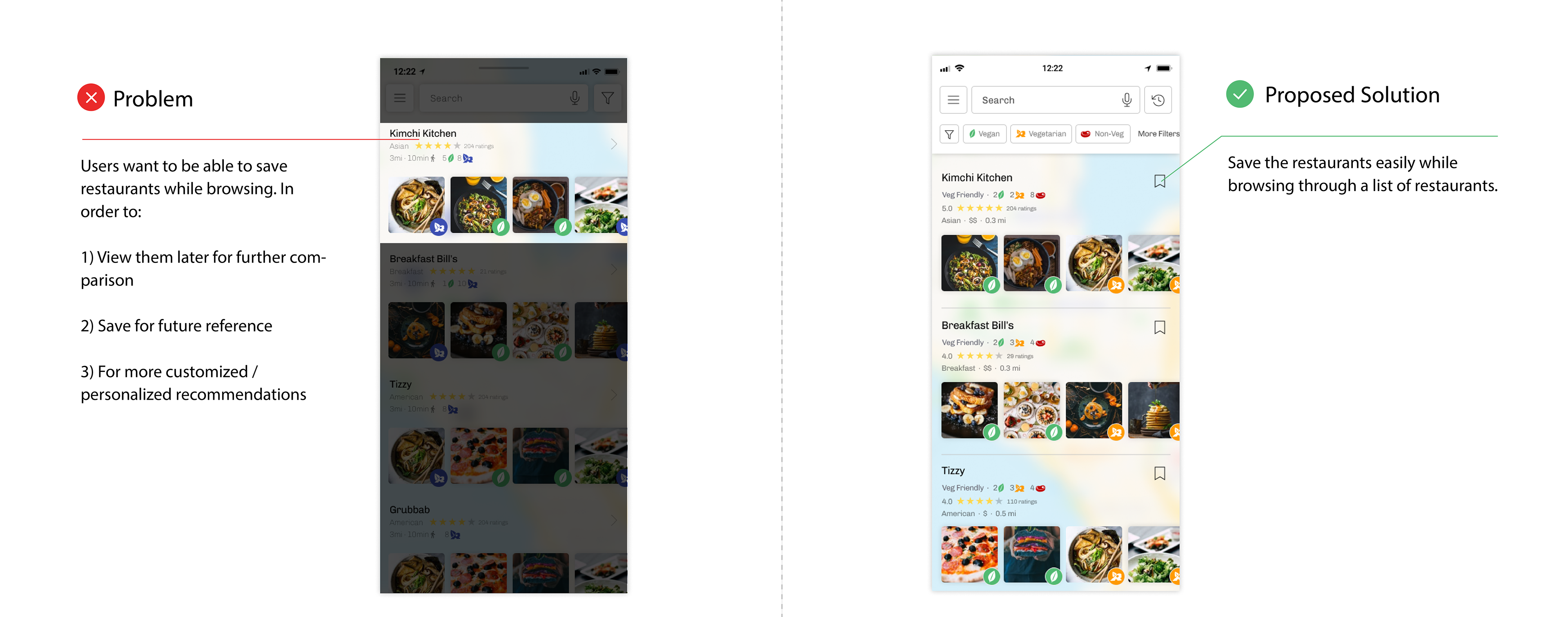
• Bookmark restaurants for later view / comparison.
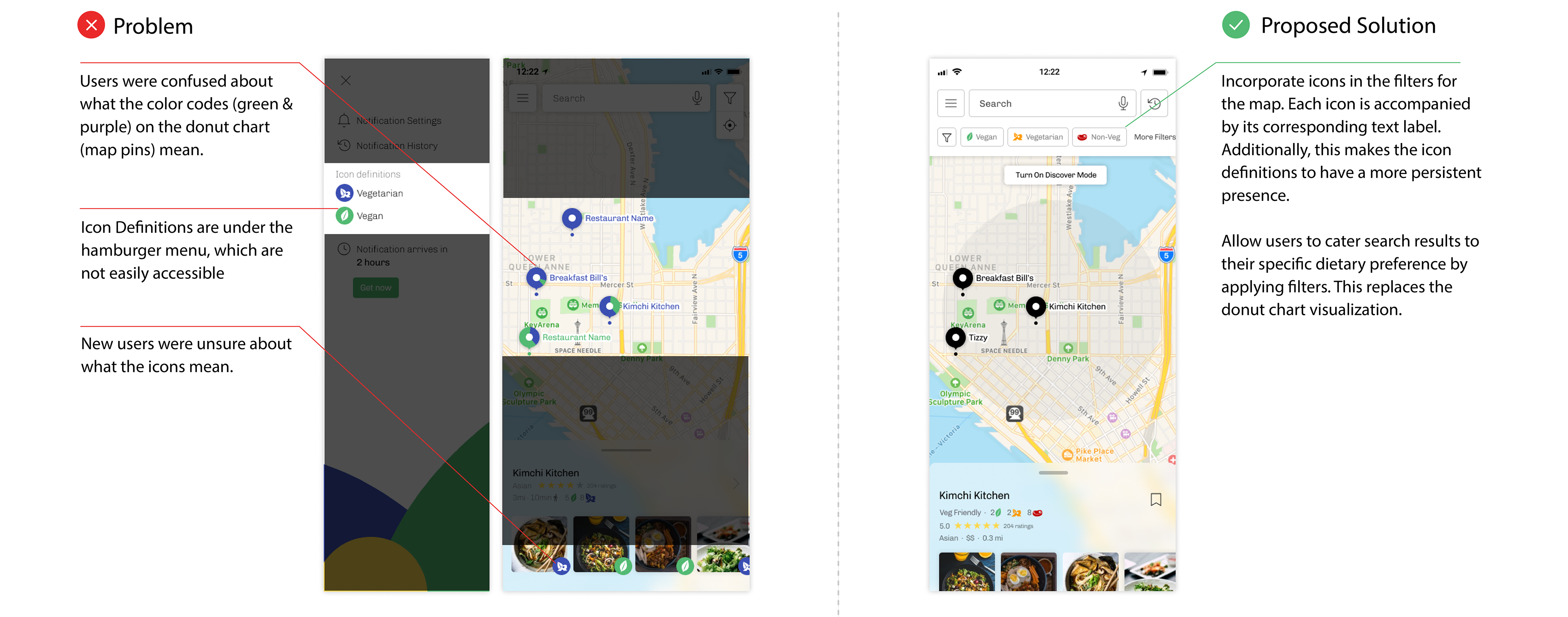
Filtering By Categories
• Multiple levels of filtering to help users quickly identify sustainable options.
• Increase users' confidence in menu by providing clear categorization.
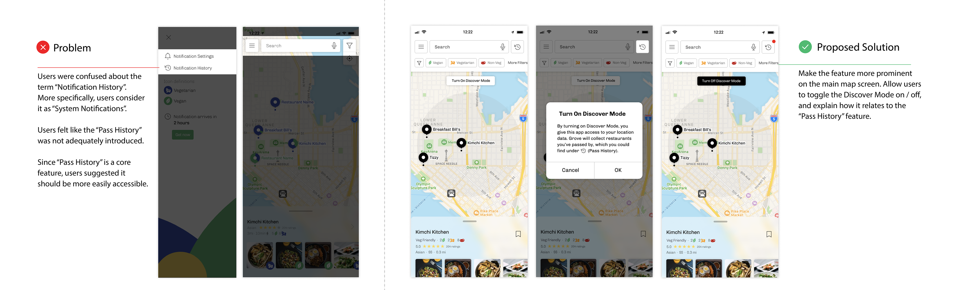
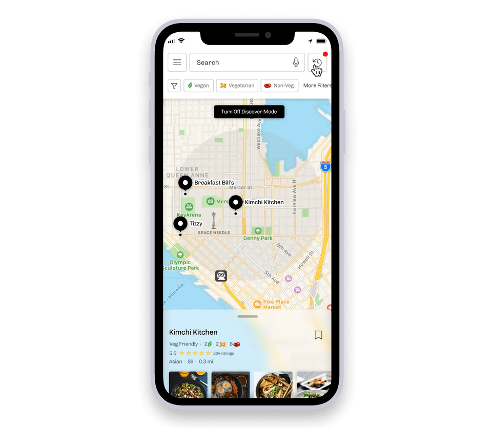
Turning On Discover Mode
• This key feature is a more subtle way to help vegans and vegetarians discover new sustainable options.
• When "Discover Mode" is on, the system will collect restaurants with sustainable veg options for users to view later.
• Users have control over when they want the app to collect restaurant information. This addresses user concerns with data sharing & privacy.

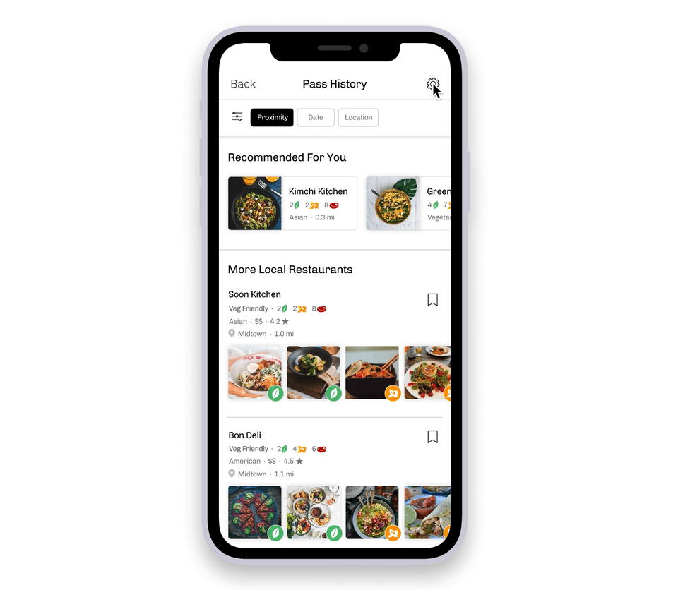
Viewing Pass History
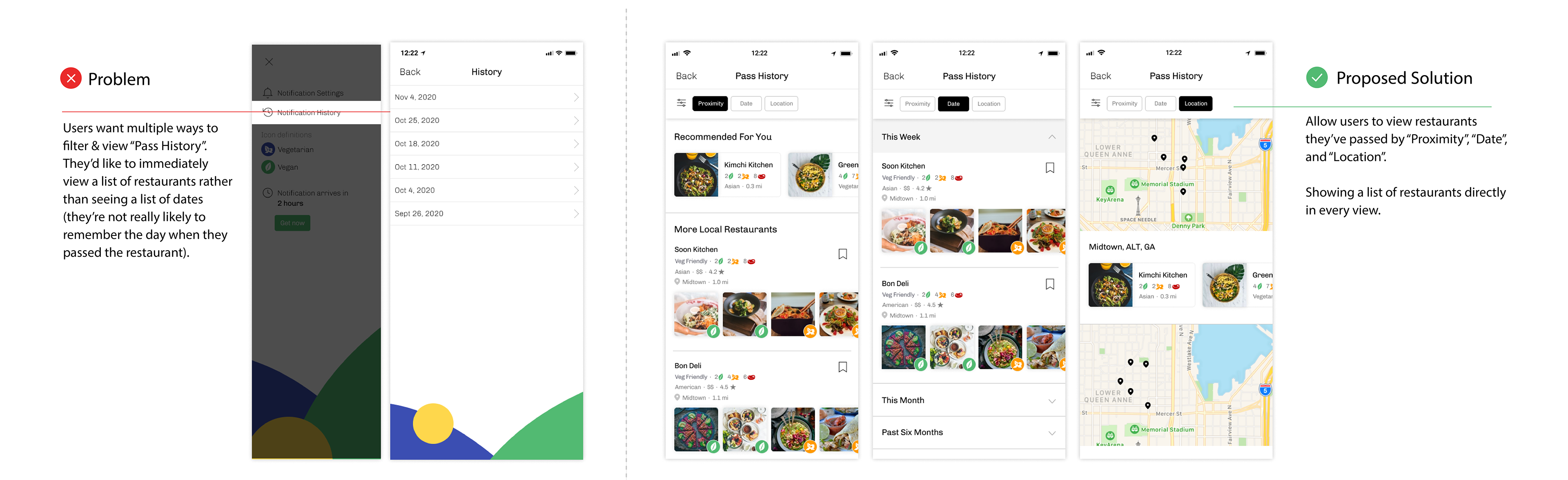
• "Pass History" is a collection of restaurants (with sustainable veg options) that users have passed by during the day.
• There are multiple ways to sort & view the restaurants. From our feedback sessions, some users preferred to view by date, while others preferred to view by proximity or location. These different views give users more flexibility based on their preference and/or use scenarios.
Setting Pass Notification
• To avoid being bombarded with Pass History Notifications, users can set when to receive a list of restaurants each week.
• Some users want to learn about new options around their dining time. They can set a notification at their regular dining time as desired.
REFLECTION
Next Steps
📌 Facilitate Communication Between People With Dietary Restrictions & Servers @Restaurant
What I've Learned
✏️ Iterate, Iterate, Iterate
The iterative design process allowed us to make small, low-risk design decisions driven by user and expert feedback. It is crucial in ensuring that our solution is useful, usable and desirable for our target users.
⭐️ Trust the creative process!
The design process was messy and full of uncertainties, but everything worked out at the end!
• Divergent and convergent thinking (& methods) helped us navigate a broad problem space and eventually defined a fruitful problem area that would benefit from intervention.
• Our solution emerged from the user-centered process. It is not perfect but it addresses key user needs and continues to evolve.